Introduction: why graph literacy is a core SRE skill
Dashboards are the nervous system of modern reliability engineering. They are the first thing you open when the pager goes off and the first thing management wants to see when the incident is over. But dashboards are not reality. They are summaries of reality, stitched together from sampled data, aggregated into windows, and plotted on scales that may or may not match what your users feel.
Most engineers assume that if the dashboard is polished, it is telling the truth. But truth in dashboards is slippery. Averages can look calm while users rage. A five-minute window can erase ten-second meltdowns. A log scale can hide orders of magnitude.
Incidents often run long not because the fix is hard, but because the team misreads the graphs. At One2N we teach engineers that graph literacy is as important as knowing how to restart a pod or roll back a release. If you cannot read graphs honestly, you cannot run systems reliably.
This article is a deep guide to reading SRE graphs without fooling yourself. We will start with averages and percentiles, move through sampling windows and axis scales, dive into heatmaps, and end with a practical checklist and worked incident walkthrough.
Averages vs percentiles: why the mean can be misleading
Most dashboards default to averages. It is convenient to compute and produces smooth lines. But averages erase the very outliers that users complain about.
Imagine a checkout service. In one minute it serves 1,000 requests around 100 ms and 50 requests that take 3 seconds. The average is ~250 ms. The line is flat, calm, and looks acceptable. But 50 customers just waited three seconds to pay. Some retried, some gave up. Those are the customers whose voices fill Slack and Jira tickets.
Percentiles tell the real story. A p50 of 100 ms shows the bulk of requests. A p95 of ~160 ms tells you 95 percent of requests are still fine. A p99 near 3,000 ms reveals the painful tail. In large systems, one percent can mean thousands of people per minute.
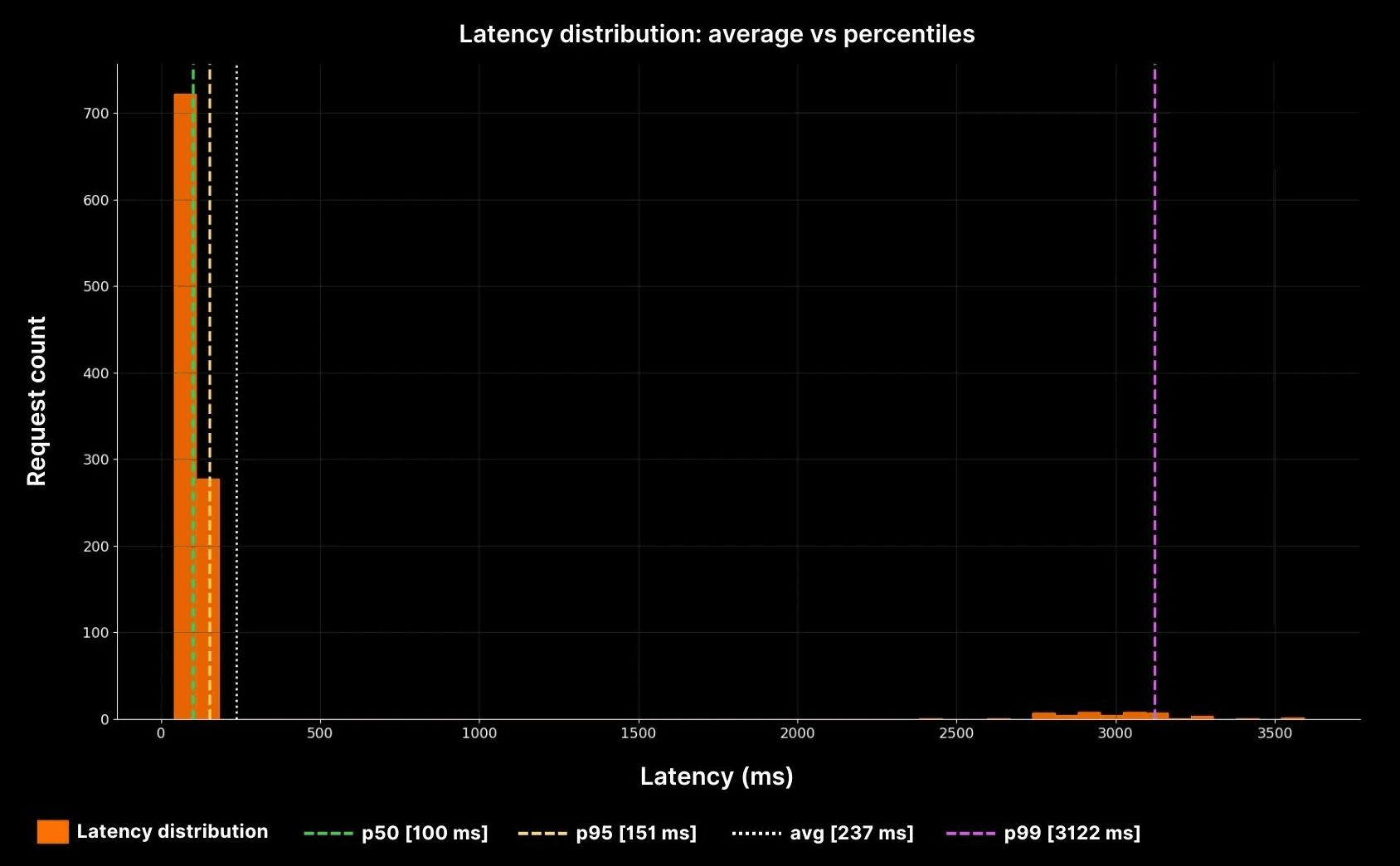
The yellow dotted line shows the average (~240 ms). But the purple p99 line at ~3,000 ms shows the real pain. This is why averages cannot be trusted in production systems. Percentiles expose the tails where reliability is won or lost.
Sampling windows: how resolution changes the story
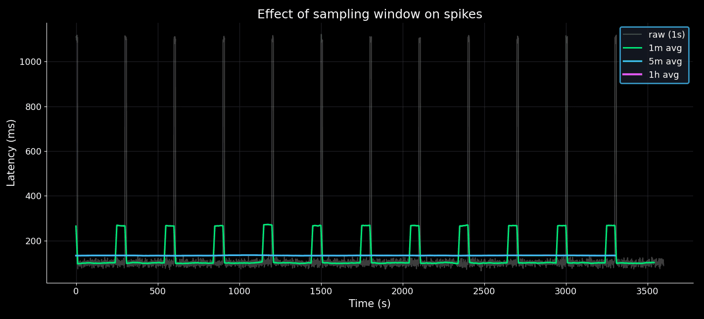
Metrics are aggregated into time windows. The size of that window can hide or reveal incidents.
Suppose an API spikes for 10 seconds every 5 minutes:
At 1-second resolution, the spikes stand out.
At 1-minute averages, the spikes are softened but visible.
At 5-minute averages, the spikes almost vanish.
At 1-hour averages, the service looks perfect.
Effect of sampling window on spikes
Axis scales: linear vs log
Dashboards sometimes use log scales. They can be useful for data spanning several orders of magnitude, but in incidents they often hide meaningful jumps.
Suppose your error rate climbs from 0.1% to 1%. That is a 10x increase. On a linear scale, the change is alarming. On a log scale, it looks like a tiny step.
Linear scale vs log scale
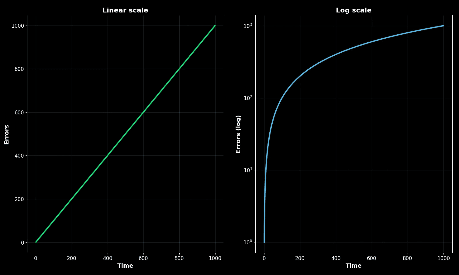
On the left, the linear scale shows a steady climb. On the right, the log scale flattens the same climb. Both are correct mathematically, but only one matches what users feel.
In practice:
Use linear during incidents so you see what customers see.
Use log only when comparing long-tailed distributions or capacity planning.
Heatmaps and density
Heatmaps show distributions over time. They are powerful, but density can trick you. A faint streak may represent thousands of failing requests.
Let’s simulate a service where most requests complete at ~100 ms, but bursts at 5,000 ms happen every 100 seconds.
Latency heatmap with hidden bursts
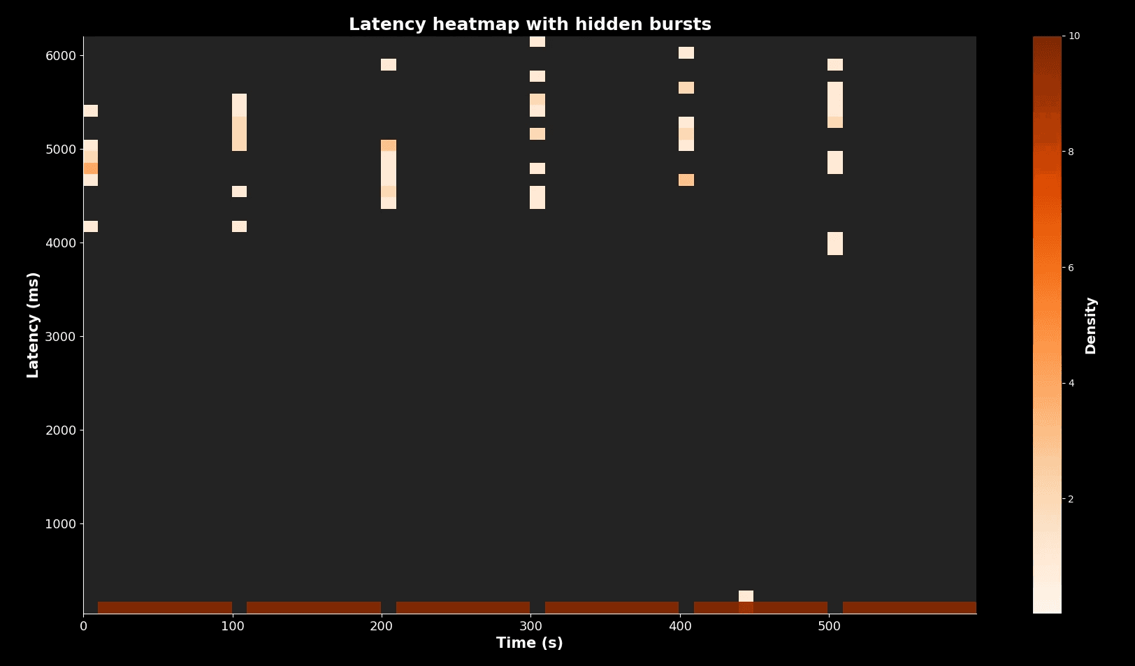
Most requests cluster in the dark band at 100 ms. But the faint vertical streaks every 100 seconds show bursts at 5,000 ms. Without care, an engineer could ignore them. With percentiles or absolute counts, you see that these are real users suffering.
Overlaying percentiles on heatmaps is the safest practice.
Checklist: habits for honest graph reading
Rather than a short list, here are the habits in detail.
1. Metric type
Always check if you are looking at averages or percentiles. Averages erase pain. Percentiles reveal tails. For example, in one client system we saw “stable” averages at 200 ms while p99s spiked to 3,500 ms. The real user pain was invisible until we switched.
2. Window size
Short windows expose spikes. Long windows smooth them away. For outages, always zoom to 10 to 30 second windows. For planning, 1 hour or 1 day windows are fine. Misreading windows is one of the most common failure modes during triage.
3. Axis scale
Know if you are looking at linear or log. Linear matches user experience. Log is for capacity planning. We once saw a 10x error spike hidden by log scale, costing two hours of triage.
4. Units
Confirm units: ms vs s, requests per second vs per minute. During an auth outage, engineers confused 10 ms with 10 s, thinking DB queries were crawling when they were actually fine. That cost the team an hour.
5. Density in heatmaps
Do not dismiss faint streaks. They can represent many requests. Cross-check with absolute numbers.
6. Correlation traps
Graphs side by side are not always correlated. A CPU rise and latency rise may be coincidence. Validate with deeper metrics before drawing conclusions.
7. Context
Graphs must be checked against logs and user reports. If users complain but graphs look calm, the graphs are wrong, misconfigured, or hiding pain in averages or long windows.
Worked incident walkthrough
At 2 a.m. the on-call SRE is paged. Alert says “checkout latency stable at 200 ms.” Yet users are complaining.
Step 1: Check percentiles. Average is calm, but p99 is spiking to 3,500 ms. The tail is burning.
Step 2: Check window. Default dashboard uses 5-minute averages. Switching to 30-second view shows repeated spikes.
Step 3: Check axis. Error rate chart uses log scale. On log, the increase looks flat. On linear, error rate is up 10x.
Step 4: Check heatmap. Faint streaks at 5,000 ms appear every 10 minutes. Investigating shows DB lockups.
Step 5: Correlate with logs. Lock contention during promotional campaign confirmed.
Time | Graph misread | Correction | Insight |
|---|---|---|---|
02:00 | Average latency flat | Check p99 | Tail on fire |
02:05 | 5m window hides spikes | Switch to 30s | Spikes visible |
02:10 | Log axis hides rise | Switch to linear | Error up 10x |
02:15 | Heatmap streak ignored | Investigate streaks | DB lock found |
This timeline shows how every trap played a role. The fix was straightforward once the graphs were read correctly.
Putting it all together
Reading graphs honestly is not a luxury. It is survival for on-call engineers.
Percentiles show user pain that averages hide.
Window size determines whether spikes are visible or lost.
Linear axes reveal impact, log axes flatten it.
Heatmaps must be read with attention to faint streaks.
Context from logs and reports validates what the dashboard shows.
At One2N, we treat graph literacy as part of the SRE math toolkit, alongside error budgets and queueing models. Teams must practise this, not assume dashboards are self-explanatory. The next time your pager goes off, remember: the graph is not the system. It is only a story. And it is your job to read that story honestly.
Introduction: why graph literacy is a core SRE skill
Dashboards are the nervous system of modern reliability engineering. They are the first thing you open when the pager goes off and the first thing management wants to see when the incident is over. But dashboards are not reality. They are summaries of reality, stitched together from sampled data, aggregated into windows, and plotted on scales that may or may not match what your users feel.
Most engineers assume that if the dashboard is polished, it is telling the truth. But truth in dashboards is slippery. Averages can look calm while users rage. A five-minute window can erase ten-second meltdowns. A log scale can hide orders of magnitude.
Incidents often run long not because the fix is hard, but because the team misreads the graphs. At One2N we teach engineers that graph literacy is as important as knowing how to restart a pod or roll back a release. If you cannot read graphs honestly, you cannot run systems reliably.
This article is a deep guide to reading SRE graphs without fooling yourself. We will start with averages and percentiles, move through sampling windows and axis scales, dive into heatmaps, and end with a practical checklist and worked incident walkthrough.
Averages vs percentiles: why the mean can be misleading
Most dashboards default to averages. It is convenient to compute and produces smooth lines. But averages erase the very outliers that users complain about.
Imagine a checkout service. In one minute it serves 1,000 requests around 100 ms and 50 requests that take 3 seconds. The average is ~250 ms. The line is flat, calm, and looks acceptable. But 50 customers just waited three seconds to pay. Some retried, some gave up. Those are the customers whose voices fill Slack and Jira tickets.
Percentiles tell the real story. A p50 of 100 ms shows the bulk of requests. A p95 of ~160 ms tells you 95 percent of requests are still fine. A p99 near 3,000 ms reveals the painful tail. In large systems, one percent can mean thousands of people per minute.
The yellow dotted line shows the average (~240 ms). But the purple p99 line at ~3,000 ms shows the real pain. This is why averages cannot be trusted in production systems. Percentiles expose the tails where reliability is won or lost.
Sampling windows: how resolution changes the story
Metrics are aggregated into time windows. The size of that window can hide or reveal incidents.
Suppose an API spikes for 10 seconds every 5 minutes:
At 1-second resolution, the spikes stand out.
At 1-minute averages, the spikes are softened but visible.
At 5-minute averages, the spikes almost vanish.
At 1-hour averages, the service looks perfect.
Effect of sampling window on spikes
Axis scales: linear vs log
Dashboards sometimes use log scales. They can be useful for data spanning several orders of magnitude, but in incidents they often hide meaningful jumps.
Suppose your error rate climbs from 0.1% to 1%. That is a 10x increase. On a linear scale, the change is alarming. On a log scale, it looks like a tiny step.
Linear scale vs log scale
On the left, the linear scale shows a steady climb. On the right, the log scale flattens the same climb. Both are correct mathematically, but only one matches what users feel.
In practice:
Use linear during incidents so you see what customers see.
Use log only when comparing long-tailed distributions or capacity planning.
Heatmaps and density
Heatmaps show distributions over time. They are powerful, but density can trick you. A faint streak may represent thousands of failing requests.
Let’s simulate a service where most requests complete at ~100 ms, but bursts at 5,000 ms happen every 100 seconds.
Latency heatmap with hidden bursts
Most requests cluster in the dark band at 100 ms. But the faint vertical streaks every 100 seconds show bursts at 5,000 ms. Without care, an engineer could ignore them. With percentiles or absolute counts, you see that these are real users suffering.
Overlaying percentiles on heatmaps is the safest practice.
Checklist: habits for honest graph reading
Rather than a short list, here are the habits in detail.
1. Metric type
Always check if you are looking at averages or percentiles. Averages erase pain. Percentiles reveal tails. For example, in one client system we saw “stable” averages at 200 ms while p99s spiked to 3,500 ms. The real user pain was invisible until we switched.
2. Window size
Short windows expose spikes. Long windows smooth them away. For outages, always zoom to 10 to 30 second windows. For planning, 1 hour or 1 day windows are fine. Misreading windows is one of the most common failure modes during triage.
3. Axis scale
Know if you are looking at linear or log. Linear matches user experience. Log is for capacity planning. We once saw a 10x error spike hidden by log scale, costing two hours of triage.
4. Units
Confirm units: ms vs s, requests per second vs per minute. During an auth outage, engineers confused 10 ms with 10 s, thinking DB queries were crawling when they were actually fine. That cost the team an hour.
5. Density in heatmaps
Do not dismiss faint streaks. They can represent many requests. Cross-check with absolute numbers.
6. Correlation traps
Graphs side by side are not always correlated. A CPU rise and latency rise may be coincidence. Validate with deeper metrics before drawing conclusions.
7. Context
Graphs must be checked against logs and user reports. If users complain but graphs look calm, the graphs are wrong, misconfigured, or hiding pain in averages or long windows.
Worked incident walkthrough
At 2 a.m. the on-call SRE is paged. Alert says “checkout latency stable at 200 ms.” Yet users are complaining.
Step 1: Check percentiles. Average is calm, but p99 is spiking to 3,500 ms. The tail is burning.
Step 2: Check window. Default dashboard uses 5-minute averages. Switching to 30-second view shows repeated spikes.
Step 3: Check axis. Error rate chart uses log scale. On log, the increase looks flat. On linear, error rate is up 10x.
Step 4: Check heatmap. Faint streaks at 5,000 ms appear every 10 minutes. Investigating shows DB lockups.
Step 5: Correlate with logs. Lock contention during promotional campaign confirmed.
Time | Graph misread | Correction | Insight |
|---|---|---|---|
02:00 | Average latency flat | Check p99 | Tail on fire |
02:05 | 5m window hides spikes | Switch to 30s | Spikes visible |
02:10 | Log axis hides rise | Switch to linear | Error up 10x |
02:15 | Heatmap streak ignored | Investigate streaks | DB lock found |
This timeline shows how every trap played a role. The fix was straightforward once the graphs were read correctly.
Putting it all together
Reading graphs honestly is not a luxury. It is survival for on-call engineers.
Percentiles show user pain that averages hide.
Window size determines whether spikes are visible or lost.
Linear axes reveal impact, log axes flatten it.
Heatmaps must be read with attention to faint streaks.
Context from logs and reports validates what the dashboard shows.
At One2N, we treat graph literacy as part of the SRE math toolkit, alongside error budgets and queueing models. Teams must practise this, not assume dashboards are self-explanatory. The next time your pager goes off, remember: the graph is not the system. It is only a story. And it is your job to read that story honestly.
In this post
In this post
Section
Share
Share
In this post
section
Share
Keywords
SRE, dashboards, metrics, graphs, how to read SRE graphs, production incidents, percentiles, averages, heatmaps, site reliability engineering, troubleshooting, observability, monitoring, root cause analysis, performance, engineering best practices, incident response, one2n