Introduction: Why SREs must care about Queues
Almost every system you run as an SRE is a queue. Requests come in, they wait for resources, and then they are served. Sometimes the wait is negligible. Other times, it balloons and users see timeouts.
Queueing theory is the math that explains this behaviour. The reason it matters is simple: the difference between 70% and 90% utilisation is not just “20 percentage points.” It is the difference between a system that feels stable and one that collapses under load.
At One2N, we often meet teams who say: “Our CPUs are at 90% but everything seems fine.” Then suddenly a spike hits, queues explode, latency multiplies, and the incident takes hours to unwind. Queueing math explains exactly why this happens, and why designing with headroom is not waste, but insurance.
The M/M/1 model in plain english
The M/M/1 queue is the simplest way to understand this.
M: arrivals follow a Poisson process (random arrivals at a fixed average rate λ).
M: service times are exponential (each request takes a random amount of time, average rate μ).
1: there is one “server” (this can mean a CPU core, a database worker, or a single-threaded process).
The model gives us this formula:

Where:
W = average response time
μ = service rate (max requests per second the system can handle)
λ = arrival rate (actual requests per second)
As λ approaches μ, response time W explodes.
You do not need the math to see the danger. Imagine a coffee shop with one barista who can make 60 coffees per hour. If 50 customers arrive per hour, the queue stays short. If 58 customers arrive per hour, the barista barely keeps up. If 59 arrive per hour, the line keeps growing and never clears.
Visualising Latency vs Utilisation
Queueing delay grows as utilisation approaches 100%
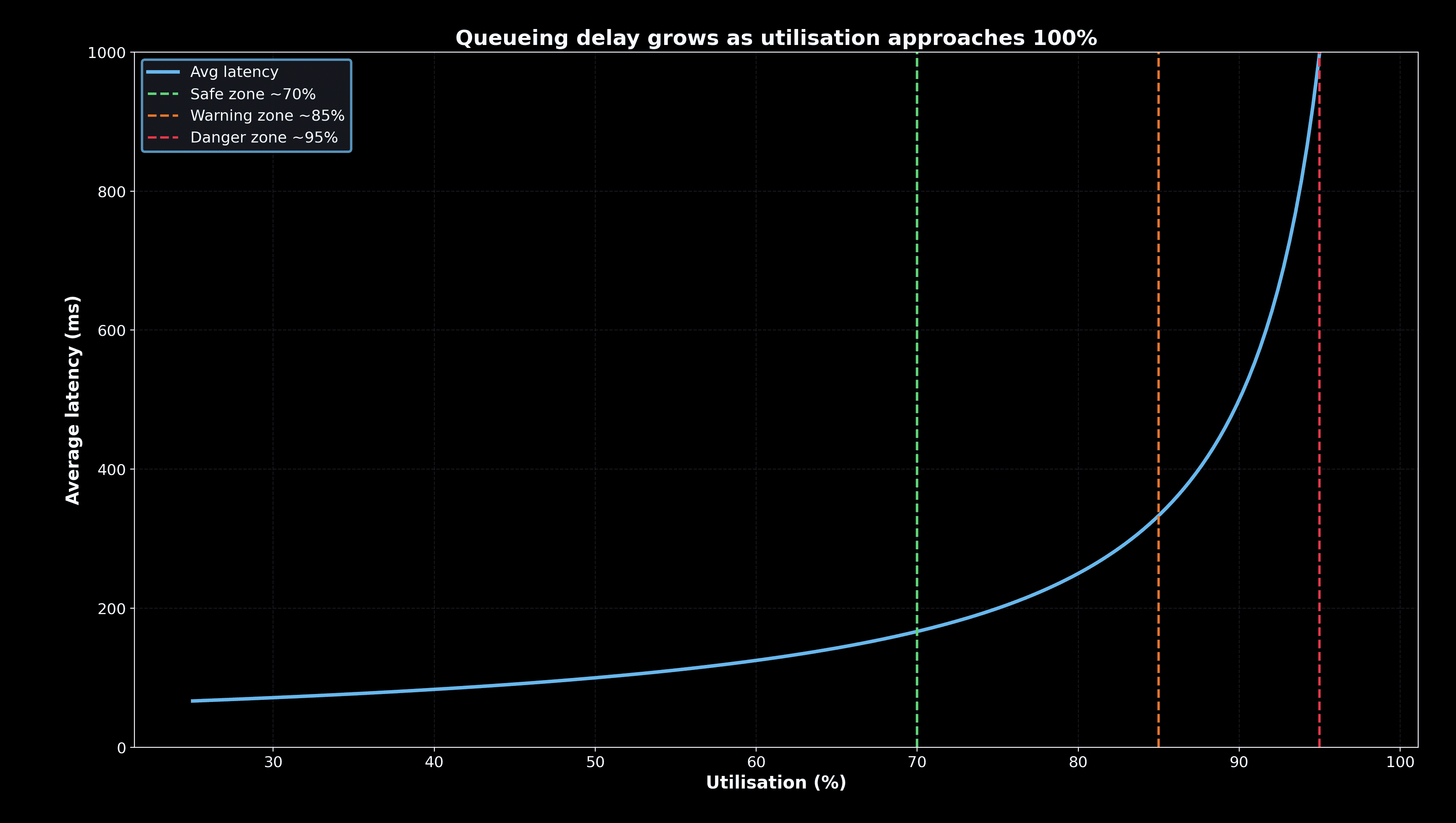
The graph makes the cliff effect obvious. Latency is flat until about 70%. Past 85%, it climbs fast. At 95%, the system is essentially unusable. This is why SREs insist on leaving headroom and push back when teams try to “maximise efficiency.”
Practical insights for reliability engineers
1. Headroom is not waste
Teams often think of unused capacity as “money left on the table.” But the math shows the opposite. Running consistently at 60 to 70% utilisation means your system can absorb traffic spikes, failover events, and retry storms. That unused margin is what buys you reliability.
2. Retries amplify the problem
When a request fails, clients retry. If the system is already at 90% utilisation, retries add more load than it can handle. The result is a feedback loop where every failure generates new requests, making queues grow faster than operators can react.
3. Tail latency hides in queues
Even if the median request looks fine, queueing makes slow requests much worse. One unlucky user might wait 10× longer than the median. That “tail” is what users feel, and why SREs monitor p95 and p99 percentiles instead of averages.
4. Error budgets shrink quickly
A system running near 95% utilisation does not just have higher latency, it also burns through error budgets. A 30-minute overload can consume a month’s allowance. Queueing theory makes the connection between high utilisation and SLO breaches explicit.
Decision Table: Making Queueing Operational
Utilisation range | Latency behaviour | Risk level | SRE guidance |
|---|---|---|---|
0 to 70% | Latency flat, queues minimal | Low | Safe to run steadily |
70 to 85% | Latency rising, early warnings | Medium | Start planning capacity increase |
85 to 95% | Latency unstable, retries dangerous | High | Alert and scale before users notice |
95 to 100% | Latency unbounded, collapse imminent | Critical | Incident response required |
This is how you turn abstract queueing math into actionable rules for on-call engineers!
Worked Examples
Example 1: API Gateway at 70% vs 90%
At 70% utilisation, average latency stays near 50 ms. At 90%, average latency grows to 500 ms. For an API gateway, this means user apps start timing out. The same hardware looks fine one day and broken the next, purely because of load.
Example 2: Background Jobs
A queue of batch jobs may tolerate longer delays. Running at 85% utilisation is acceptable here because users are not directly waiting. But the same numbers in a checkout path would cause lost revenue. Queueing math helps teams decide where they can afford to run hotter.
Example 3: Retry Storm After Outage
A database outage lasts 5 minutes. When it recovers, clients resend thousands of failed requests. The system jumps from 60% utilisation to 95% instantly. Queues explode, and the system fails again. The root cause is not just the database, but how queues amplify retries.
How Queueing Theory connects to Error Budgets
This cluster links directly to the previous one on error budgets. Operating in the “red zone” above 90% means:
You risk consuming the entire budget in one incident.
Error budget burn rate spikes because queues delay every user.
Recovery becomes slow, so even short spikes have long tails.
Queueing math gives you the evidence to argue for conservative capacity targets. It is not opinion. It is math that matches real user pain.
Putting it all together
Queueing theory turns reliability from guesswork into numbers. For reliability engineers, the key lessons are:
Systems that look efficient at 90% are fragile.
Headroom around 60 to 70% is the safest operating point.
Retries and spikes make queues grow far faster than intuition.
Tail latency, not averages, defines user experience.
Error budgets disappear quickly once queues grow.
At One2N, we use these principles when designing both AI and cloud-native systems. Whether it is a payment API or an observability pipeline, the same math applies. By teaching engineers to read queues, we help them predict and prevent incidents rather than just reacting at 2 A.M
Internal links:
Previous cluster: Error Budget Calculation: Downtime Minutes for Every SLO
Next cluster: Reading SRE Graphs Without Fooling Yourself
Related talk: Just enough queueing theory to be dangerous - Chinmay Naik
Introduction: Why SREs must care about Queues
Almost every system you run as an SRE is a queue. Requests come in, they wait for resources, and then they are served. Sometimes the wait is negligible. Other times, it balloons and users see timeouts.
Queueing theory is the math that explains this behaviour. The reason it matters is simple: the difference between 70% and 90% utilisation is not just “20 percentage points.” It is the difference between a system that feels stable and one that collapses under load.
At One2N, we often meet teams who say: “Our CPUs are at 90% but everything seems fine.” Then suddenly a spike hits, queues explode, latency multiplies, and the incident takes hours to unwind. Queueing math explains exactly why this happens, and why designing with headroom is not waste, but insurance.
The M/M/1 model in plain english
The M/M/1 queue is the simplest way to understand this.
M: arrivals follow a Poisson process (random arrivals at a fixed average rate λ).
M: service times are exponential (each request takes a random amount of time, average rate μ).
1: there is one “server” (this can mean a CPU core, a database worker, or a single-threaded process).
The model gives us this formula:
Where:
W = average response time
μ = service rate (max requests per second the system can handle)
λ = arrival rate (actual requests per second)
As λ approaches μ, response time W explodes.
You do not need the math to see the danger. Imagine a coffee shop with one barista who can make 60 coffees per hour. If 50 customers arrive per hour, the queue stays short. If 58 customers arrive per hour, the barista barely keeps up. If 59 arrive per hour, the line keeps growing and never clears.
Visualising Latency vs Utilisation
Queueing delay grows as utilisation approaches 100%
The graph makes the cliff effect obvious. Latency is flat until about 70%. Past 85%, it climbs fast. At 95%, the system is essentially unusable. This is why SREs insist on leaving headroom and push back when teams try to “maximise efficiency.”
Practical insights for reliability engineers
1. Headroom is not waste
Teams often think of unused capacity as “money left on the table.” But the math shows the opposite. Running consistently at 60 to 70% utilisation means your system can absorb traffic spikes, failover events, and retry storms. That unused margin is what buys you reliability.
2. Retries amplify the problem
When a request fails, clients retry. If the system is already at 90% utilisation, retries add more load than it can handle. The result is a feedback loop where every failure generates new requests, making queues grow faster than operators can react.
3. Tail latency hides in queues
Even if the median request looks fine, queueing makes slow requests much worse. One unlucky user might wait 10× longer than the median. That “tail” is what users feel, and why SREs monitor p95 and p99 percentiles instead of averages.
4. Error budgets shrink quickly
A system running near 95% utilisation does not just have higher latency, it also burns through error budgets. A 30-minute overload can consume a month’s allowance. Queueing theory makes the connection between high utilisation and SLO breaches explicit.
Decision Table: Making Queueing Operational
Utilisation range | Latency behaviour | Risk level | SRE guidance |
|---|---|---|---|
0 to 70% | Latency flat, queues minimal | Low | Safe to run steadily |
70 to 85% | Latency rising, early warnings | Medium | Start planning capacity increase |
85 to 95% | Latency unstable, retries dangerous | High | Alert and scale before users notice |
95 to 100% | Latency unbounded, collapse imminent | Critical | Incident response required |
This is how you turn abstract queueing math into actionable rules for on-call engineers!
Worked Examples
Example 1: API Gateway at 70% vs 90%
At 70% utilisation, average latency stays near 50 ms. At 90%, average latency grows to 500 ms. For an API gateway, this means user apps start timing out. The same hardware looks fine one day and broken the next, purely because of load.
Example 2: Background Jobs
A queue of batch jobs may tolerate longer delays. Running at 85% utilisation is acceptable here because users are not directly waiting. But the same numbers in a checkout path would cause lost revenue. Queueing math helps teams decide where they can afford to run hotter.
Example 3: Retry Storm After Outage
A database outage lasts 5 minutes. When it recovers, clients resend thousands of failed requests. The system jumps from 60% utilisation to 95% instantly. Queues explode, and the system fails again. The root cause is not just the database, but how queues amplify retries.
How Queueing Theory connects to Error Budgets
This cluster links directly to the previous one on error budgets. Operating in the “red zone” above 90% means:
You risk consuming the entire budget in one incident.
Error budget burn rate spikes because queues delay every user.
Recovery becomes slow, so even short spikes have long tails.
Queueing math gives you the evidence to argue for conservative capacity targets. It is not opinion. It is math that matches real user pain.
Putting it all together
Queueing theory turns reliability from guesswork into numbers. For reliability engineers, the key lessons are:
Systems that look efficient at 90% are fragile.
Headroom around 60 to 70% is the safest operating point.
Retries and spikes make queues grow far faster than intuition.
Tail latency, not averages, defines user experience.
Error budgets disappear quickly once queues grow.
At One2N, we use these principles when designing both AI and cloud-native systems. Whether it is a payment API or an observability pipeline, the same math applies. By teaching engineers to read queues, we help them predict and prevent incidents rather than just reacting at 2 A.M
Internal links:
Previous cluster: Error Budget Calculation: Downtime Minutes for Every SLO
Next cluster: Reading SRE Graphs Without Fooling Yourself
Related talk: Just enough queueing theory to be dangerous - Chinmay Naik
In this post
In this post
Section
Share
Share
In this post
section
Share
Keywords
queueing theory, reliability engineering, SRE, system latency, headroom, utilisation, API gateway, error budgets, retry storm, tail latency, capacity planning, service reliability, downtime, performance modelling, cloud systems, site reliability, system stability, incident response, traffic spikes, scalability, operational guidance