Introduction: the hidden cost of running “hot”
Many engineering teams celebrate high utilisation. It looks efficient: every CPU cycle or request slot is busy. But in practice, running too close to the limit is one of the fastest ways to create latency spikes, angry users, and midnight incidents.
Throughput (how many requests per second your system can handle) and latency (how long each request takes) are connected by queueing math. When load approaches capacity, even small fluctuations cause queues to form. Latency shoots up, error budgets burn quickly, and systems feel unpredictable.
At One2N, we often see systems tuned for “efficiency” rather than resilience. This article explains how to balance throughput with latency, why headroom matters, and how SRE math gives you the numbers to back your design choices.
Throughput, Latency, and Utilisation
Throughput is the number of requests processed per second. Latency is the time a request spends in the system. Utilisation is the fraction of system capacity currently used.
The key relationship is simple:
At low utilisation, latency is close to raw service time.
As utilisation rises past ~80 to 85%, queues grow faster than intuition suggests.
At 100% utilisation, latency tends toward infinity where the system cannot catch up.
This is why SREs insist on capacity headroom. Running at 60 to 70% keeps latency stable and leaves room for spikes.
Visualising latency growth near capacity
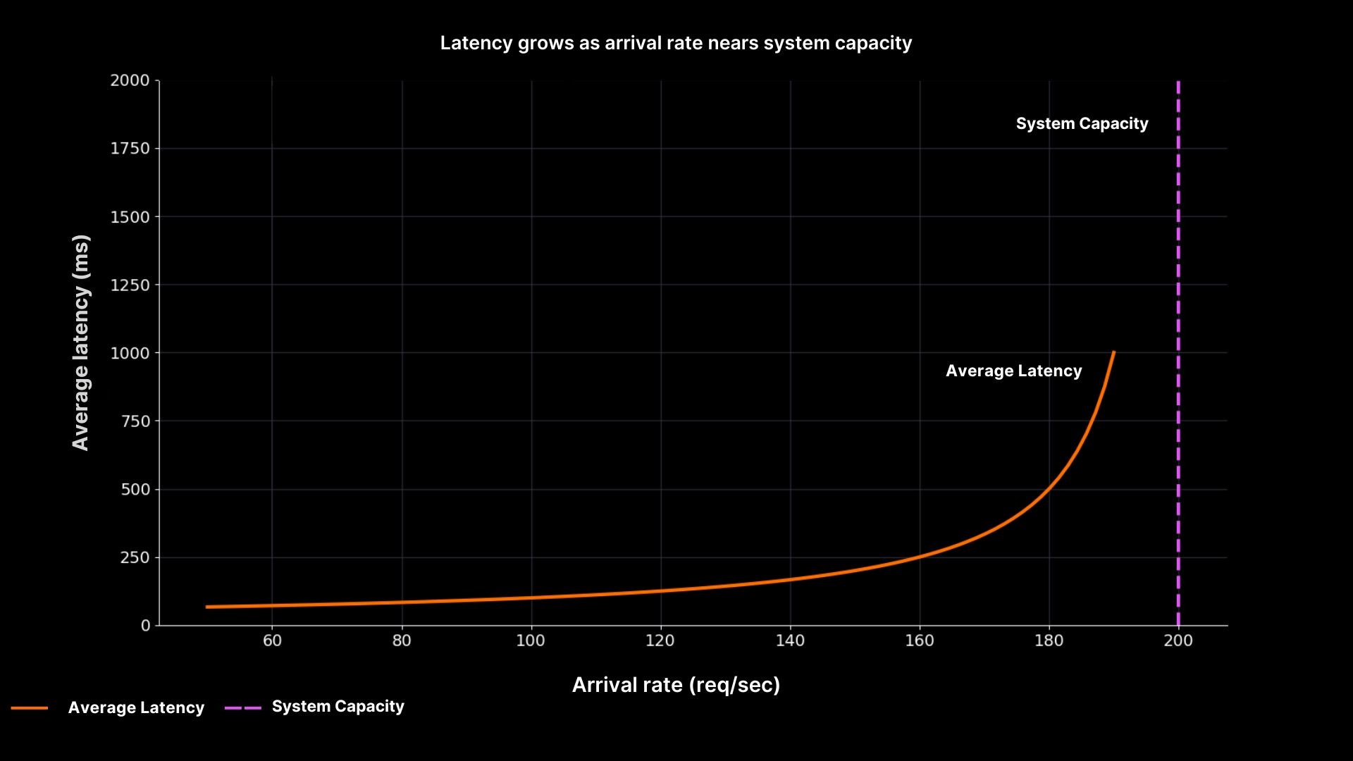
Latency rises sharply as arrival rate nears system capacity
The graph shows why “running hot” is unsafe. Latency is flat until utilisation nears 90%, then shoots upward. At 200 req/sec, the system stalls completely. This curve explains countless 2 a.m. incidents where dashboards looked fine until the queue suddenly exploded.
Queueing theory in practice
Queueing math (M/M/1 model) gives us a simple formula:
Waiting time formula (M/M/1):

Utilisation definition:

Where:
W = average waiting time
ρ = utilisation
λ = arrival rate (requests per second)
μ = service rate (requests served per second)
S = average service time
As utilisation grows, the denominator (1 – ρ) shrinks, so waiting time skyrockets.
This is why SREs argue for headroom. A system at 60% utilisation can absorb spikes gracefully. A system at 95% utilisation has no margin, even a small increase in load causes cascading delays.
Decision table: safe utilisation targets
Utilisation range | Latency behaviour | Risk level | SRE recommendation |
|---|---|---|---|
0–70% | Latency stable, queues minimal | Low | Safe for steady workloads |
70–85% | Latency rising slowly | Medium | Monitor carefully, plan capacity increases |
85–95% | Latency unstable, queues grow fast | High | Avoid sustained operation here |
95–100% | Latency unbounded, system collapses | Critical | Red flag, add capacity immediately |
This table translates the math into operational guidance. It turns abstract percentages into clear thresholds that teams can monitor and act upon.
How this connects to reliability engineering
This is not just about performance. Throughput and latency directly affect SLOs and error budgets. For example:
If p95 latency rises beyond the SLO, you burn budget even if average latency looks fine.
If queues grow, retries amplify the load, creating a feedback loop that ends in outages.
If systems lack headroom, deployments during peak load become risky, slowing release velocity.
At One2N, we position this as reliable AI and cloud systems in production. Clients do not just want speed, they want predictability. Latency vs throughput trade-offs must be explicit in both design reviews and business promises.
Putting it all together
When you balance throughput against latency, you are really deciding how much risk your system carries. SRE math shows that efficiency is not free: chasing high utilisation almost always hurts reliability.
Practical takeaways:
Always monitor latency percentiles, not just averages.
Track utilisation and set safe thresholds (e.g. alerts at 85%).
Leave headroom and design for 60-70% steady state, not 95%.
Link these decisions to business outcomes by tying them to SLOs and release velocity.
This way, SRE teams can justify capacity planning with clear numbers, not hand-waving. And when leadership asks “why not run hotter?”, you can show them the math and the graphs.
Introduction: the hidden cost of running “hot”
Many engineering teams celebrate high utilisation. It looks efficient: every CPU cycle or request slot is busy. But in practice, running too close to the limit is one of the fastest ways to create latency spikes, angry users, and midnight incidents.
Throughput (how many requests per second your system can handle) and latency (how long each request takes) are connected by queueing math. When load approaches capacity, even small fluctuations cause queues to form. Latency shoots up, error budgets burn quickly, and systems feel unpredictable.
At One2N, we often see systems tuned for “efficiency” rather than resilience. This article explains how to balance throughput with latency, why headroom matters, and how SRE math gives you the numbers to back your design choices.
Throughput, Latency, and Utilisation
Throughput is the number of requests processed per second. Latency is the time a request spends in the system. Utilisation is the fraction of system capacity currently used.
The key relationship is simple:
At low utilisation, latency is close to raw service time.
As utilisation rises past ~80 to 85%, queues grow faster than intuition suggests.
At 100% utilisation, latency tends toward infinity where the system cannot catch up.
This is why SREs insist on capacity headroom. Running at 60 to 70% keeps latency stable and leaves room for spikes.
Visualising latency growth near capacity
Latency rises sharply as arrival rate nears system capacity
The graph shows why “running hot” is unsafe. Latency is flat until utilisation nears 90%, then shoots upward. At 200 req/sec, the system stalls completely. This curve explains countless 2 a.m. incidents where dashboards looked fine until the queue suddenly exploded.
Queueing theory in practice
Queueing math (M/M/1 model) gives us a simple formula:
Waiting time formula (M/M/1):
Utilisation definition:
Where:
W = average waiting time
ρ = utilisation
λ = arrival rate (requests per second)
μ = service rate (requests served per second)
S = average service time
As utilisation grows, the denominator (1 – ρ) shrinks, so waiting time skyrockets.
This is why SREs argue for headroom. A system at 60% utilisation can absorb spikes gracefully. A system at 95% utilisation has no margin, even a small increase in load causes cascading delays.
Decision table: safe utilisation targets
Utilisation range | Latency behaviour | Risk level | SRE recommendation |
|---|---|---|---|
0–70% | Latency stable, queues minimal | Low | Safe for steady workloads |
70–85% | Latency rising slowly | Medium | Monitor carefully, plan capacity increases |
85–95% | Latency unstable, queues grow fast | High | Avoid sustained operation here |
95–100% | Latency unbounded, system collapses | Critical | Red flag, add capacity immediately |
This table translates the math into operational guidance. It turns abstract percentages into clear thresholds that teams can monitor and act upon.
How this connects to reliability engineering
This is not just about performance. Throughput and latency directly affect SLOs and error budgets. For example:
If p95 latency rises beyond the SLO, you burn budget even if average latency looks fine.
If queues grow, retries amplify the load, creating a feedback loop that ends in outages.
If systems lack headroom, deployments during peak load become risky, slowing release velocity.
At One2N, we position this as reliable AI and cloud systems in production. Clients do not just want speed, they want predictability. Latency vs throughput trade-offs must be explicit in both design reviews and business promises.
Putting it all together
When you balance throughput against latency, you are really deciding how much risk your system carries. SRE math shows that efficiency is not free: chasing high utilisation almost always hurts reliability.
Practical takeaways:
Always monitor latency percentiles, not just averages.
Track utilisation and set safe thresholds (e.g. alerts at 85%).
Leave headroom and design for 60-70% steady state, not 95%.
Link these decisions to business outcomes by tying them to SLOs and release velocity.
This way, SRE teams can justify capacity planning with clear numbers, not hand-waving. And when leadership asks “why not run hotter?”, you can show them the math and the graphs.
In this post
In this post
Section
Share
Share
In this post
section
Share
Keywords
SRE, latency, throughput, reliability, high utilisation, system performance, downtime, queueing theory, cloud engineering, One2N, site reliability engineering, capacity planning, traffic spikes, service degradation, performance optimization, technical blog, infrastructure, scalability, efficiency, systems management