Introduction: why percentiles matter in site reliability engineering
In Site Reliability Engineering, metrics are the foundation of decision making. But not all metrics are equal. Many monitoring tools default to averages, and averages are dangerously misleading. A flat average graph may suggest stability, but users may still be waiting seconds for responses. If your team only watches averages, you are blind to the part of the system that causes the most pain.
At One2N, we often find this gap in client systems during reliability reviews. Engineers confidently point to “stable” averages, while percentile charts tell a very different story. This article explains why percentiles such as p50, p95, p99 are essential to SRE practice. We will look at how to read them, what they reveal about user experience, and how to decide which percentiles to monitor in production.
The problem with averages
Consider this example. Your system handles 1,000 requests in 100 ms. At the same time, 50 requests take between 2 and 5 seconds. The math produces an average of about 200 ms. The dashboard shows a stable, flat number.
But those 50 requests still matter. Each one represents a frustrated user who waited seconds instead of milliseconds. They are the ones who open support tickets, retry transactions, and abandon checkouts. The average hides their pain.
This is why SREs treat averages with suspicion. They compress a distribution into a single value and erase the very extremes that define user experience.
Percentiles: speaking the language of tails
Percentiles describe distributions in a way that matches reality.
p50 (median): Half of requests are faster, half slower. A good measure of “typical” behaviour.
p95: 5 percent of requests are slower than this. A strong early warning for degraded performance.
p99: The slowest one percent of requests. In systems serving thousands of requests per second, this is still thousands of slow experiences every minute.
This framing is powerful. Instead of saying “average latency is 200 ms,” you can say “95 percent of users get responses under 500 ms, but 1 percent wait up to 5 seconds.” That difference changes how incidents are diagnosed and how service levels are negotiated with product teams.
Code and graph: average vs percentiles
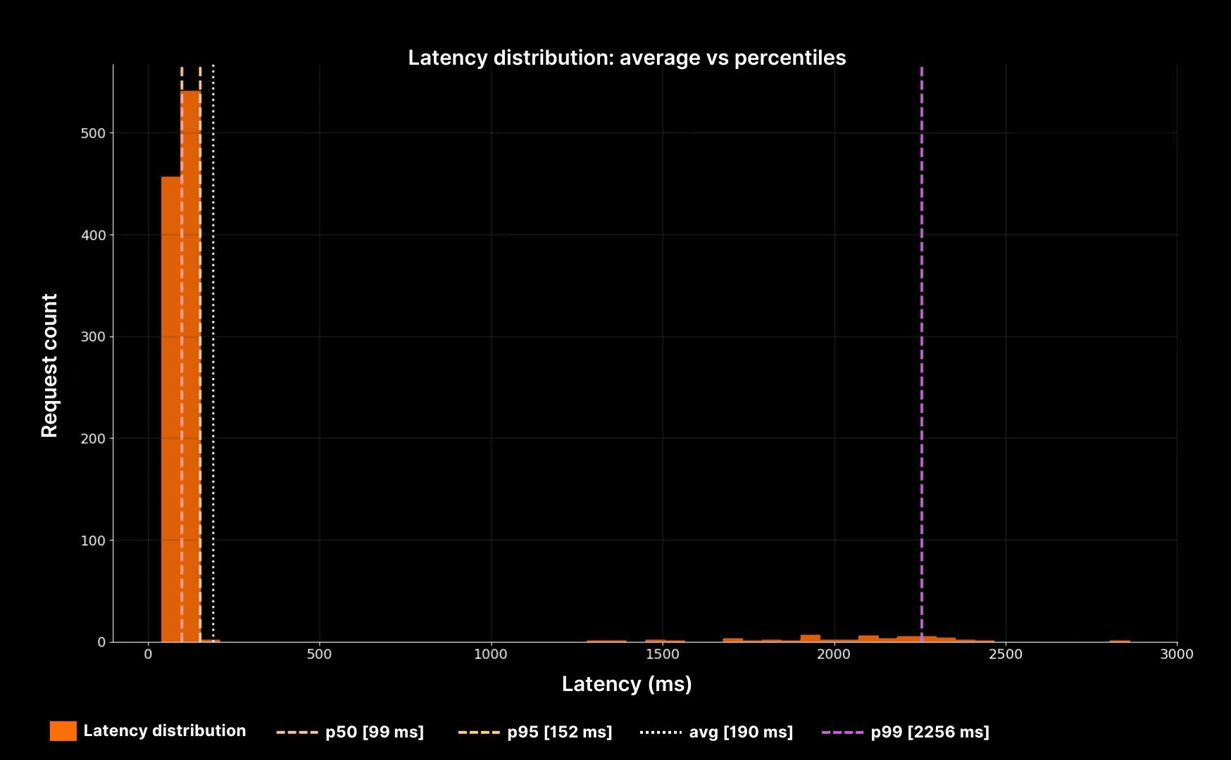
Latency distribution: average vs percentiles
The histogram makes the point clear. The white dotted line shows the average, but it sits far away from the real experience. The dashed lines (p50, p95, p99) reveal the true shape: a fast bulk, a long slow tail, and a small group of users suffering seconds of delay.
How to choose the right percentiles to monitor
Not every system needs every percentile. Picking which ones to track is a decision that depends on your workload and your users. Here is a decision table to guide that choice.
System type | Typical user expectation | Suggested percentiles | Why it matters |
|---|---|---|---|
Web checkout or payments | Fast and predictable | p50, p95, p99 | Even 1% of slow checkouts means lost revenue. |
Internal admin tools | Tolerant to occasional slowness | p50, p95 | Smooth experience for most users is good enough. |
APIs serving mobile apps | Sensitive to tail | p50, p90, p99 | Network + app latency compounds, tail hurts adoption. |
Batch jobs | Throughput focused | p95 | Bulk completion time is key, tails less critical. |
This decision table shows why there is no universal rule. The percentiles you choose should match the stakes of your system.
Tying percentiles back to SRE practice
Percentiles are not just about better graphs. They tie directly into SRE practices:
Error budgets: A spike in p99 latency often coincides with budget burn. Tracking tails helps teams spot and prevent breaches.
Capacity planning: Rising p95 or p99 latency as throughput grows indicates queues forming. This links directly to the next cluster, Latency vs Throughput.
On-call clarity: During incidents, percentile graphs shorten diagnosis time. You see at a glance whether pain is concentrated in the tail or spread across all users.
At One2N, we encourage teams to start every reliability conversation with percentiles. They are the most direct way to connect system metrics with user experience.
Putting it all together
When you are on-call, do not stop at averages. Look at the full distribution. Percentiles expose the reality that averages flatten away.
In practice, this means:
Use p50 to describe the “typical” case.
Use p95 to check if a minority of users are degraded.
Use p99 to protect against tail latency that destroys trust.
Always connect percentiles back to business outcomes. A 1% tail in payments is far more costly than in an internal tool.
This perspective makes you more effective as an engineer. You stop debating “is the system fine?” and start answering “which users are suffering, and why?” That is the essence of Site Reliability Engineering.
Introduction: why percentiles matter in site reliability engineering
In Site Reliability Engineering, metrics are the foundation of decision making. But not all metrics are equal. Many monitoring tools default to averages, and averages are dangerously misleading. A flat average graph may suggest stability, but users may still be waiting seconds for responses. If your team only watches averages, you are blind to the part of the system that causes the most pain.
At One2N, we often find this gap in client systems during reliability reviews. Engineers confidently point to “stable” averages, while percentile charts tell a very different story. This article explains why percentiles such as p50, p95, p99 are essential to SRE practice. We will look at how to read them, what they reveal about user experience, and how to decide which percentiles to monitor in production.
The problem with averages
Consider this example. Your system handles 1,000 requests in 100 ms. At the same time, 50 requests take between 2 and 5 seconds. The math produces an average of about 200 ms. The dashboard shows a stable, flat number.
But those 50 requests still matter. Each one represents a frustrated user who waited seconds instead of milliseconds. They are the ones who open support tickets, retry transactions, and abandon checkouts. The average hides their pain.
This is why SREs treat averages with suspicion. They compress a distribution into a single value and erase the very extremes that define user experience.
Percentiles: speaking the language of tails
Percentiles describe distributions in a way that matches reality.
p50 (median): Half of requests are faster, half slower. A good measure of “typical” behaviour.
p95: 5 percent of requests are slower than this. A strong early warning for degraded performance.
p99: The slowest one percent of requests. In systems serving thousands of requests per second, this is still thousands of slow experiences every minute.
This framing is powerful. Instead of saying “average latency is 200 ms,” you can say “95 percent of users get responses under 500 ms, but 1 percent wait up to 5 seconds.” That difference changes how incidents are diagnosed and how service levels are negotiated with product teams.
Code and graph: average vs percentiles
Latency distribution: average vs percentiles
The histogram makes the point clear. The white dotted line shows the average, but it sits far away from the real experience. The dashed lines (p50, p95, p99) reveal the true shape: a fast bulk, a long slow tail, and a small group of users suffering seconds of delay.
How to choose the right percentiles to monitor
Not every system needs every percentile. Picking which ones to track is a decision that depends on your workload and your users. Here is a decision table to guide that choice.
System type | Typical user expectation | Suggested percentiles | Why it matters |
|---|---|---|---|
Web checkout or payments | Fast and predictable | p50, p95, p99 | Even 1% of slow checkouts means lost revenue. |
Internal admin tools | Tolerant to occasional slowness | p50, p95 | Smooth experience for most users is good enough. |
APIs serving mobile apps | Sensitive to tail | p50, p90, p99 | Network + app latency compounds, tail hurts adoption. |
Batch jobs | Throughput focused | p95 | Bulk completion time is key, tails less critical. |
This decision table shows why there is no universal rule. The percentiles you choose should match the stakes of your system.
Tying percentiles back to SRE practice
Percentiles are not just about better graphs. They tie directly into SRE practices:
Error budgets: A spike in p99 latency often coincides with budget burn. Tracking tails helps teams spot and prevent breaches.
Capacity planning: Rising p95 or p99 latency as throughput grows indicates queues forming. This links directly to the next cluster, Latency vs Throughput.
On-call clarity: During incidents, percentile graphs shorten diagnosis time. You see at a glance whether pain is concentrated in the tail or spread across all users.
At One2N, we encourage teams to start every reliability conversation with percentiles. They are the most direct way to connect system metrics with user experience.
Putting it all together
When you are on-call, do not stop at averages. Look at the full distribution. Percentiles expose the reality that averages flatten away.
In practice, this means:
Use p50 to describe the “typical” case.
Use p95 to check if a minority of users are degraded.
Use p99 to protect against tail latency that destroys trust.
Always connect percentiles back to business outcomes. A 1% tail in payments is far more costly than in an internal tool.
This perspective makes you more effective as an engineer. You stop debating “is the system fine?” and start answering “which users are suffering, and why?” That is the essence of Site Reliability Engineering.
In this post
In this post
Section
Share
Share
In this post
section
Share
Keywords
site reliability engineering, SRE, percentiles, latency, averages, monitoring, p50, p95, p99, reliability, performance metrics, tail latency, error budgets, cloud native, incident diagnosis, latency monitoring, user experience, system metrics, capacity planning, production monitoring, One2N